Every year, “those in the know” at the top painting and decorating supply manufacturers and retailers work their magic behind the scenes and come up with what they think will be the HOT colors for the upcoming year. Known as “The Color of the Year”, these hues are chosen with many things in mind.
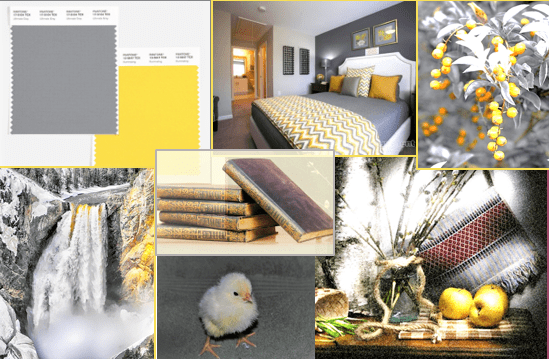
For instance, from the PANTONE Color Institute, the “Color of the Year” for 2021 is actually two colors, which happens occasionally. Given the unprecedented, chaotic, and distressing year we experienced in 2020, they felt the colors for 2021 should evoke more positive emotions. To that end, we have PANTONE Ultimate Gray 17-5104 + PANTONE Illuminating 13-0647. Ultimate Gray is a medium shade of gray. Not meant to feel dull or common, but rather like a solid, elemental, natural base; something you can count on. Illuminating is a sunny yellow and is thought to bring on feelings of warmth and optimism.
The fusion of these two colors is a complimentary blend of stability, resilience, energy, and hope. We provide examples of these two colors together in PANTONE’S color swatch, a bedroom with Ultimate Gray accent wall with illuminating yellow throw pillows and striped comforter, several stems of greenery shown in gray tones with a color shock of orange and yellow berries, a gorgeous waterfall surrounded by gray rock streaked golden yellow from the sun, vintage gray hardback books with yellow gold lettering, a fluffy yellow and white baby chick with gray background, and a still-life with gray plaster wall and golden apples (in addition to other great complimentary colors). Hopefully, these examples will give ideas to how these great colors can be used together.
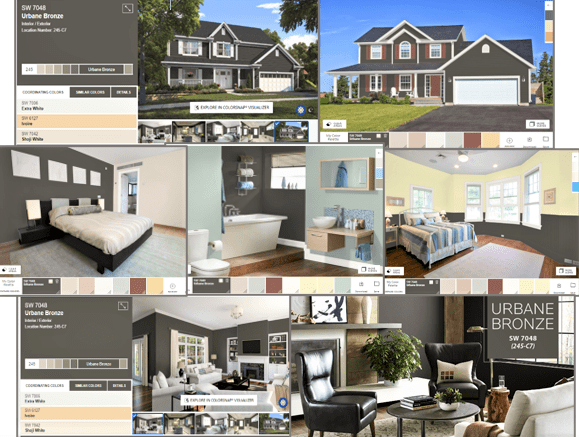
Sherwin Williams had a similar response to the events of 2020. They felt that the natural reaction to last year’s turmoil was to create sanctuary in the homes where we are now spending so much more of our time. In Urbane Bronze SW 7048 they felt they found a nature-inspired yet sophisticated choice for their Color of the Year for 2021. It is a dark, warm hue, which pairs just as well with warm yellows and reds as it does cooler blues and greens. Given its darker shade, it works especially well on accent walls as well as trim work and doors. It’s also really nice for exteriors.
Most of the examples we provide are from the Sherwin Williams’ website, using their COLORSNAP VISUALIZER. There are examples of exteriors as well several interior rooms including bedrooms, living rooms, a bathroom, and a kitchen. If you have never used the COLORSNAP VISUALIZER, it can be a great tool for getting ideas for how certain colors look together. You can also upload photos of the room you want to paint and “try on” the colors on your actual room.


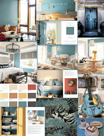
Benjamin Moore has an entire Color Trends 2021 Palette, which includes their Color of the Year 2021, Aegean Teal 2136-40. This gorgeous medium, slightly weathered, blue-green shade is meant to instill a sense of warmth, contentment, balance, and harmony. Allow it and the 11 other earth-toned hues in this palette to soothe your frazzled nerves as you relax and practice self-care in the comfort of your home. Below we offer several examples from Benjamin Moore’s Color Trends 2021 Palette brochure, which shows the beautiful Aegean Blue in several different interior rooms and types of lighting, as well as an exterior entry door.
We have also included photos from the brochure of the entire 2021 color palette, and then some photos we really liked that showed this shade on different textiles and surfaces with other complimentary colors. You can see the Benjamin Moore website for more examples of ways to use the palette in your own home.
Download our March Newsletter today.

