Q: Do you have any new color tips you could share with us when considering spring painting?
A: Yes! Not only is spring a great time to do some house painting because the warmer weather allows for outdoor projects as well as indoor projects, but by spring we have information in from the top color institutes and painting companies as to their “Color Of The Year” choices for the New Year. Hopefully some of the information we included below will provide inspiration when planning your spring painting project!
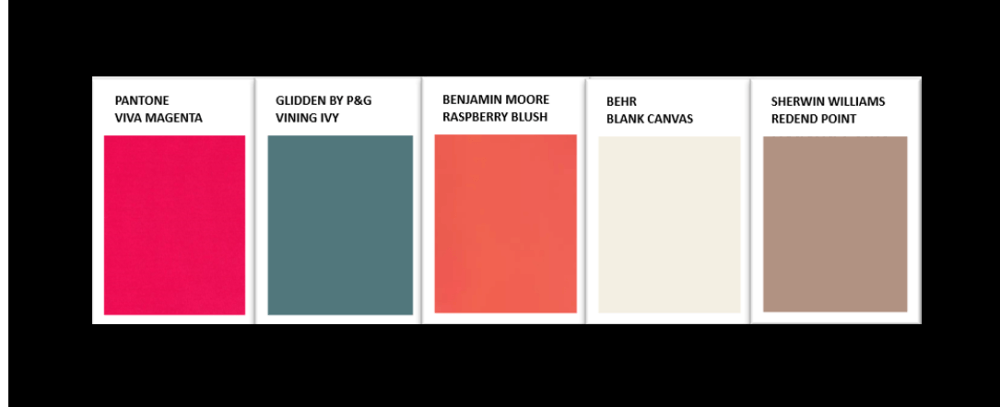
Colors of the Year for 2023 ~ Viva Magenta, Vining Ivy, Raspberry Blush, Blank Canvas, & Redend Point There are always some interesting and unexpected choices for Color of the Year, and this year is no different. First, from the Pantone Color Institute, is Viva Magenta 18-1750. Pantone describes their color choice as, “Powerful, electrifying, fearless, and pulsating”. They call Viva Magenta, “a transformative red tone with a perfect balance of warm and cool”. They say, “The crimson hue was inspired by the red of cochineal – one of the strongest and brightest dyes in the world.” See below where we have included photos of it used in paletes from Pantone, in advertising collaborations they have done with top brands using this rich tone, and other interesting photos of images found in nature or in the abstract. Enjoy this brilliant pop of color and let it remind you of spring flowers and summer sunsets.

Next, we have from Glidden, Vining Ivy. They describe this comforting blue & green color as part of an “…earthy palete…”, that creates a welcoming environ which is both soothing as well as a “touch of luxe”. It brings thoughts of the ocean and would look great in a beach house or sea-themed décor. We love greens, so we are pro Vining Ivy.
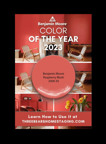
From Benjamin Moore we get the delicious Raspberry Blush 2008-30. At first glance this color is a tall glass of something cool and refreshing. Closer inspection shows it is a soft, inviting, perfect start to spring. Benjamin Moore describes it as, “coral tinged with pink”, a “charismatic color which enlivens and envelopes you in vivacious color.” It reminds us of impatiens, begonias, and tropical cocktails. We also like it paired with Glidden’s Vining Ivy.
Behr has gone very neutral this year with Blank Canvas. Their description of a “clean, fresh background…an inviting blank slate” is spot on. We agree that this creamy white feels relaxed, renewed, calm and versatile. Pair it with other neutrals for a bright interior and a good way to optically enlarge smaller spaces. Or use as a trim and ceiling color with one of the brighter or deeper colors to give them sharp edges and clean, clear boundaries.
Perhaps one of our favorite colors this year comes from Sherwin Williams, who has named Redend Point SW 9081 as their 2023 color of the year. We tend to lean more toward greens and grays most of the time in our personal preferences, but something about this soft, subtle, inviting, creamy red clay color – harboring on pink, just soothes the frazzled edges and make you want to stay awhile. We like the way it looks on kitchen cabinets, 2-story walls, exterior surfaces, just as much as accent pieces around the house such as furniture and décor pieces. It brings to mind a southwest theme, which is further enhanced by their use of advertising imagery from Antelope Canyon in Arizona and sparkling pink desert sand. If you want to try a new color but aren’t ready for something quite as bright as Viva Magenta or Raspberry Blush, consider Redend Point. It’s honestly kind of dreamy.
Share this article:

